
Emerald Cut Engagement Rings in Yellow Gold: What to Check
Compare emerald-cut diamonds in yellow gold by visible color, clarity, prong metal, setting style and construction—not just grades or carat weight.
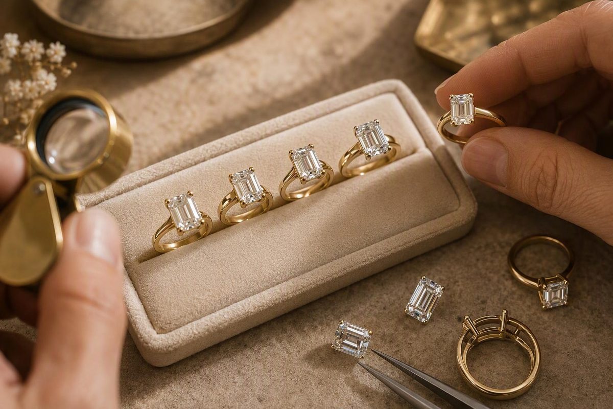
The key choice is not simply yellow gold versus white metal. It is whether you want an emerald-cut diamond to look relatively colorless against a warm band, or prefer a warmer diamond that harmonizes with the gold. That decision affects the center stone, prong color and any side stones.
Yellow gold is not a guarantee that a lower-color diamond will look white. Diamonds reflect their surroundings, including the setting. Gold can complement a warm stone, but it can also introduce yellow reflections into a colorless one. Judge the diamond and mounting together, not just their specifications separately. GIA explains how setting metal affects color appearance.
Choose the diamond’s appearance before its grade
An emerald cut has a rectangular outline, cropped corners and long step-cut facets. Its appeal is an orderly, mirror-like pattern rather than the busy sparkle of a round brilliant. Those open facets also make inclusions and body color easier to notice. GIA’s emerald-cut buying guide identifies both as important purchasing considerations.
For a relatively colorless, eye-clean starting shortlist, GIA recommends G color and VS2 clarity or higher, with higher grades suggested for larger stones. Treat that as a screening recommendation, not a universal beauty threshold or a promise that every VS2 will satisfy you. A warmer stone can be the right choice if warmth is intentional. GIA’s diamond-shape guide explains the emerald cut’s greater visibility of color and inclusions.
Ask to see each candidate:
- Face-up at a normal wearing distance, not only in magnified video.
- From the side, where you can decide whether visible tint bothers you.
- Slowly tilted under ordinary indoor light and diffuse daylight.
- In the proposed mounting, or with a comparable metal arrangement before committing.
Look for an attractive sequence of bright and dark steps as the stone moves. Investigate broad areas that remain dark or appear conspicuously see-through across several views; ask for another video rather than deciding from one flattering frame. For clarity, ask where the inclusions sit and whether you can see them without magnification.
For natural emerald-cut diamonds, GIA does not assign an overall cut grade: its overall cut grading system applies to standard round brilliants in the D–Z color range. A retailer’s “Excellent” or “Ideal” overall cut label is therefore not a GIA overall cut grade; ask what criteria it represents. Do not confuse that label with separate polish or symmetry grades. GIA explains its cut grading system.
Decide between all-yellow and two-tone construction
For an all-yellow ring, inspect how the gold prongs or bezel affect the actual stone. Choose it because you like the finished appearance—not because you expect the metal to erase tint.
If preserving a relatively colorless appearance is the priority, consider a yellow-gold shank with white-gold or platinum prongs. GIA recommends white-metal prongs for colorless and near-colorless diamonds in contrasting or two-tone rings because yellow prongs can impart yellow reflections. This changes perceived appearance, not the diamond’s laboratory color grade. GIA’s metal-setting guidance.
Confirm the metal of the head as well as the band. “Yellow gold engagement ring” does not, by itself, tell you whether every component is yellow gold.
Match the setting to how you will wear it
| Design | Why consider it | What to inspect |
|---|---|---|
| Prong-set solitaire | Keeps the rectangular outline prominent with little surrounding decoration | Prong placement, corner coverage, snagging and setting height |
| Full bezel | Adds a continuous gold frame and protects the stone’s perimeter | How much edge is covered and whether you like the mounted color appearance |
| Three-stone ring | Adds width and lets side stones reinforce or contrast with the center’s geometry | All three stones’ appearance together, especially color differences |
| East-west setting | Places the rectangle across the finger rather than along it | On-hand proportions, comfort and wedding-band clearance |
A bezel offers perimeter protection and smoother edges; prongs leave more of the stone visible but need occasional security checks. Significantly more colorless side diamonds can make a warmer center appear more yellow by comparison. These trade-offs are described in GIA’s setting guide. Horizontal, or east-west, placement is also an established option in GIA’s emerald-cut guide.
Try the intended wedding band beside the ring. Ask for a side-view photograph and measured clearance rather than assuming a straight band will sit flush.
Compare 14K and 18K without overlooking construction
14K yellow gold contains about 58.3% gold; 18K contains 75%. Higher gold content generally produces a more yellow shade, while the alloy recipe also affects color. Compare actual samples from the jeweler rather than relying on photographs from different sellers. GIA’s yellow-gold guide explains the relationship between purity, alloy and color.
Choose 18K if its richer color is worth the quoted difference to you. Consider 14K if you prefer its shade and price. Either way, request the finished shank width and thickness, resizing options and maintenance terms; karat alone is not a construction assessment.
Make the quote comparable
Before paying, obtain a written specification covering:
- Center-stone identity and natural or laboratory-grown origin, weight, millimeter dimensions and report details.
- Side-stone weights separately from the center, rather than only total carat weight.
- Gold karat, head metal, ring size and finished dimensions.
- Complete price, delivery date, return deadline and any custom-order exclusions.
Compare length and width, not just carats. An 8.0 × 5.5 mm stone has a length-to-width ratio of about 1.45; that describes its outline, not its light performance. Pay more for a difference you can identify—better-looking steps, acceptable clarity, your preferred color or stronger construction—not simply a higher specification on paper.